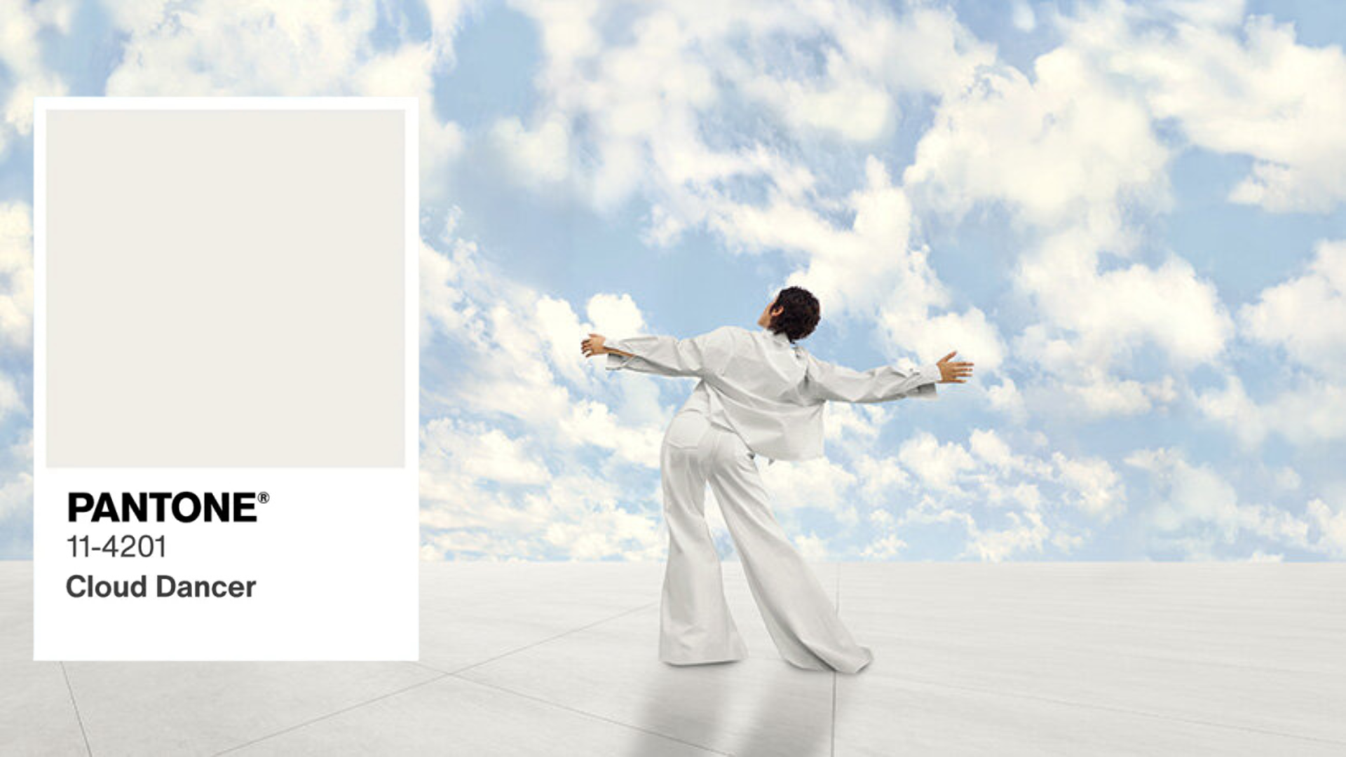
Cloud Dancer at work: bringing Pantone’s 2026 Color of the Year into commercial spaces
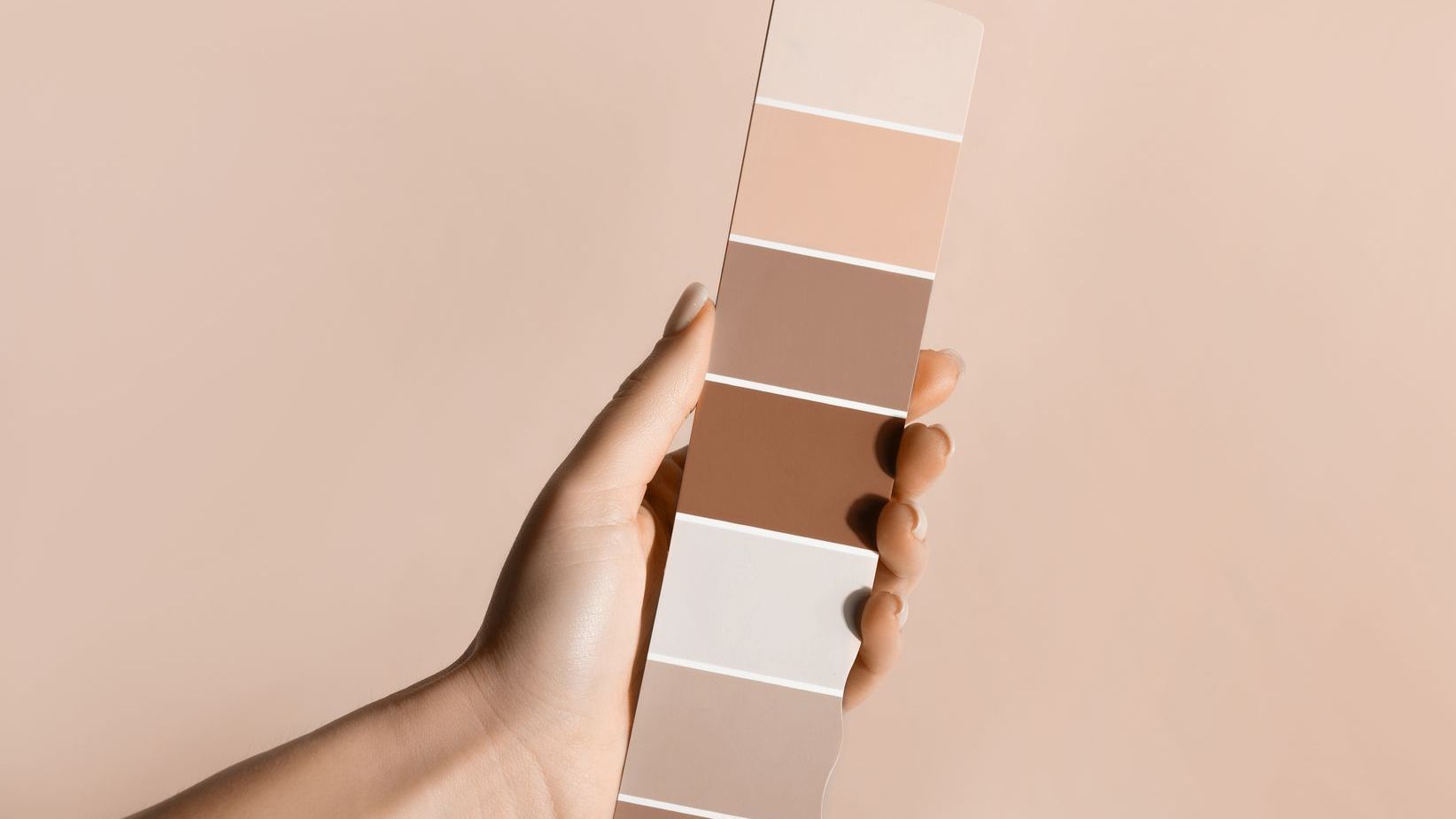
Pantone has named PANTONE 11‑4201 'Cloud Dancer' its Colour of the Year for 2026 — an airy, balanced white chosen to signal calm, clarity and fresh starts in a fast-moving world. The choice marks the first time Pantone has selected a shade of white for this annual designation.
Why Cloud Dancer matters for commercial interiors.
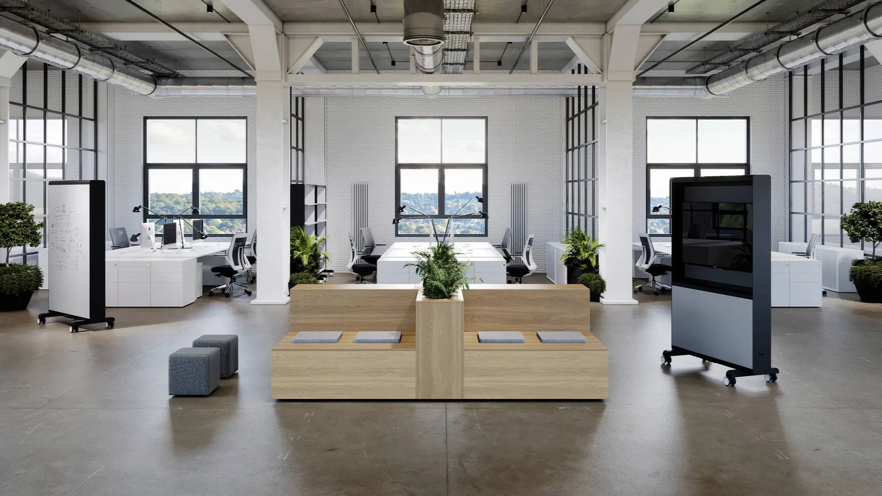
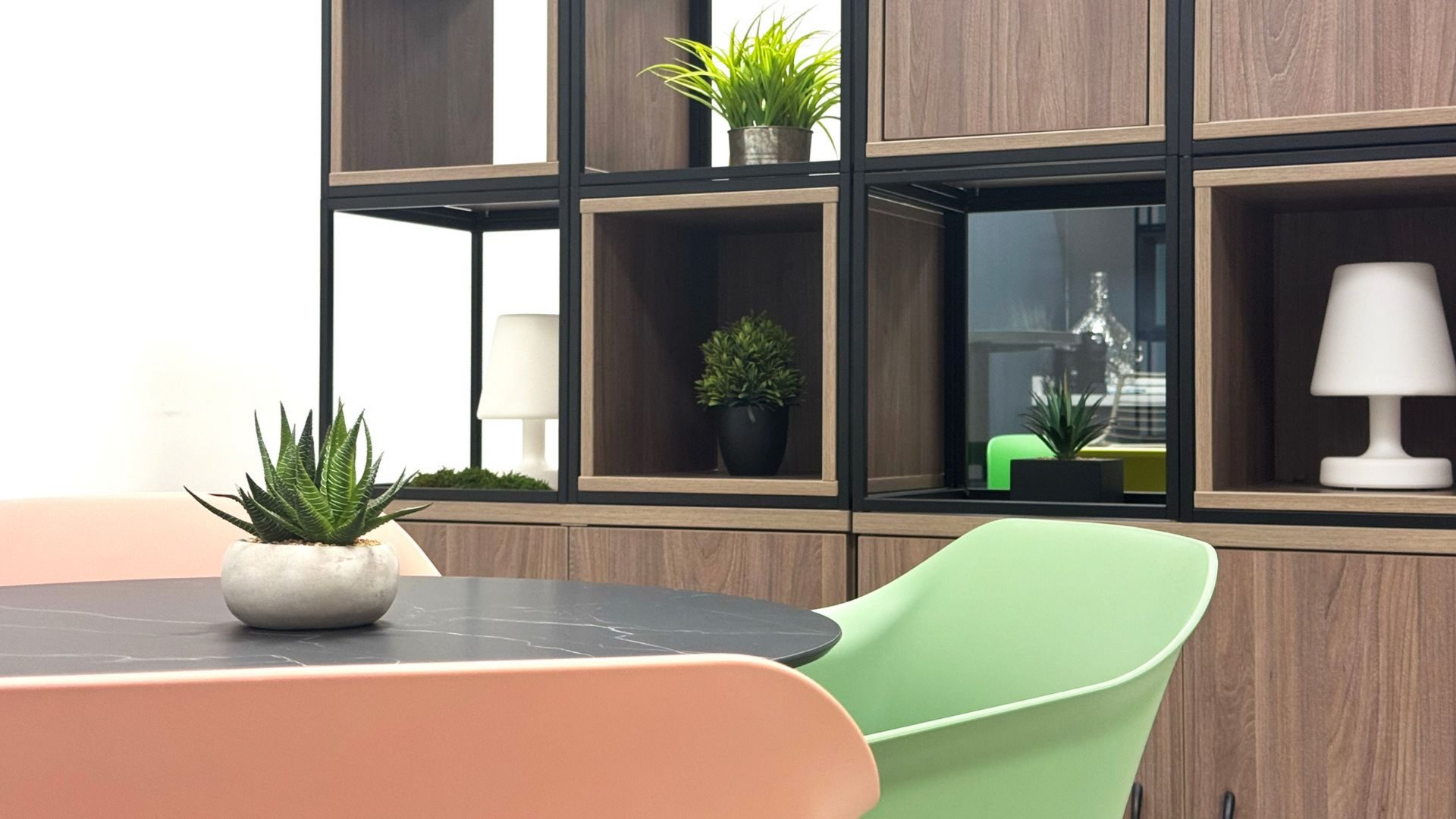
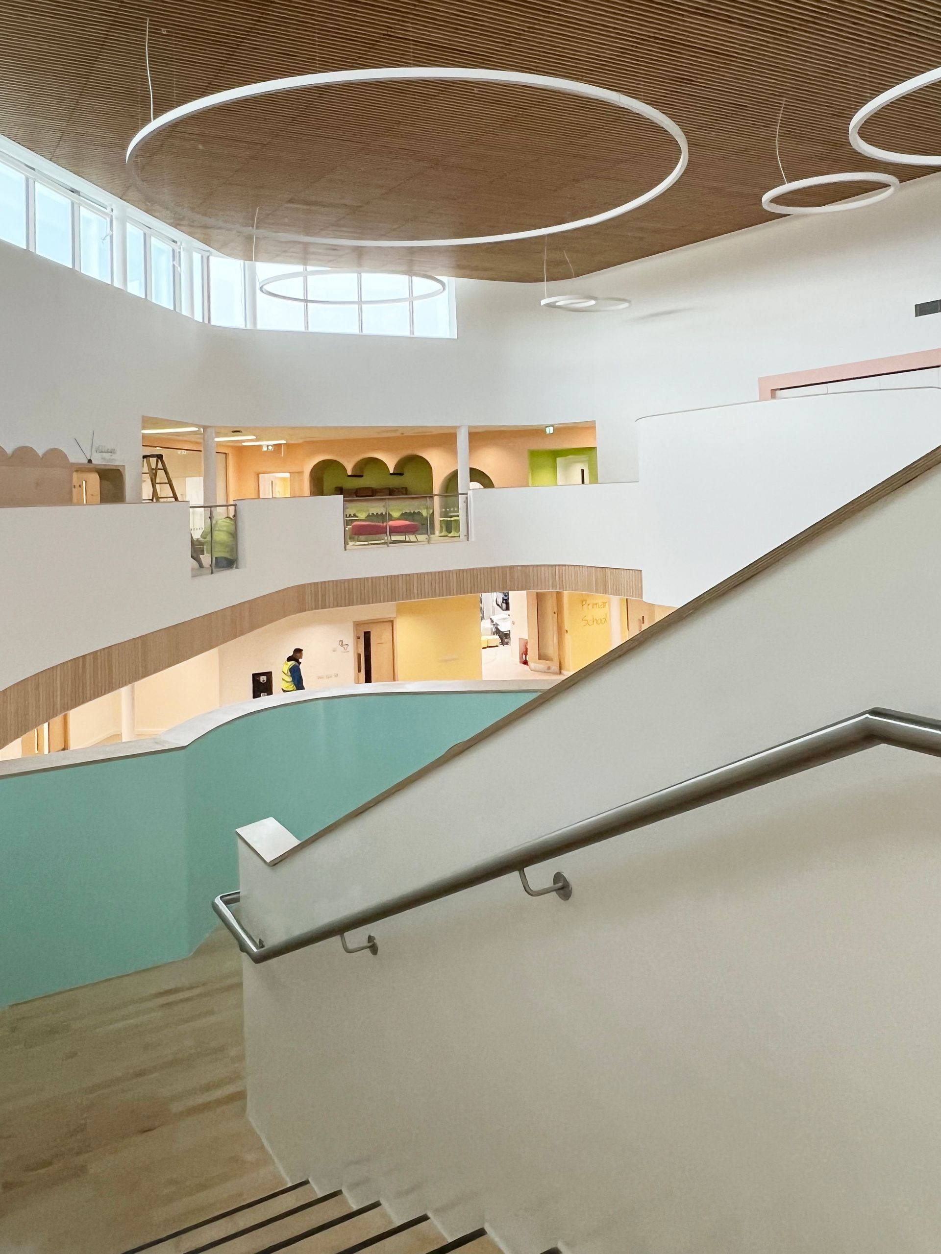
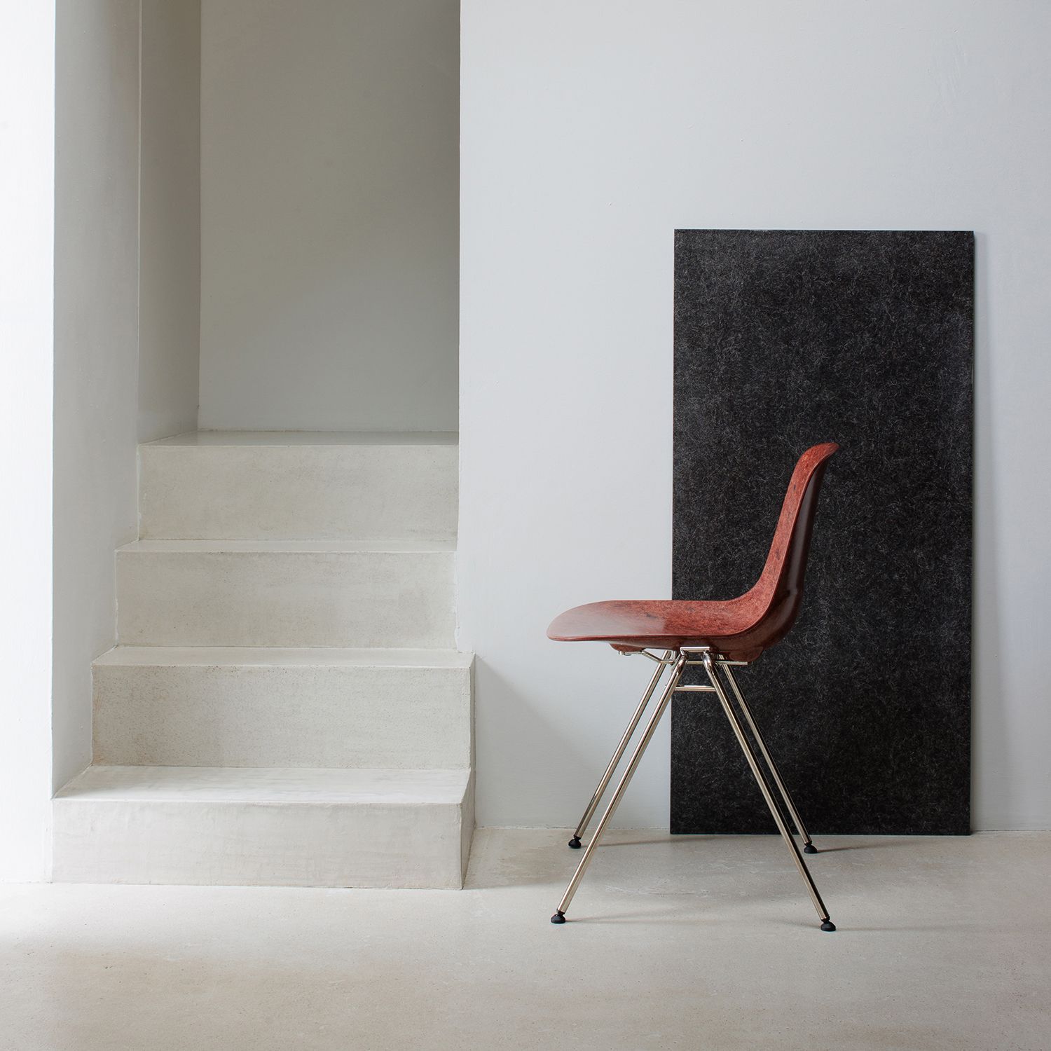
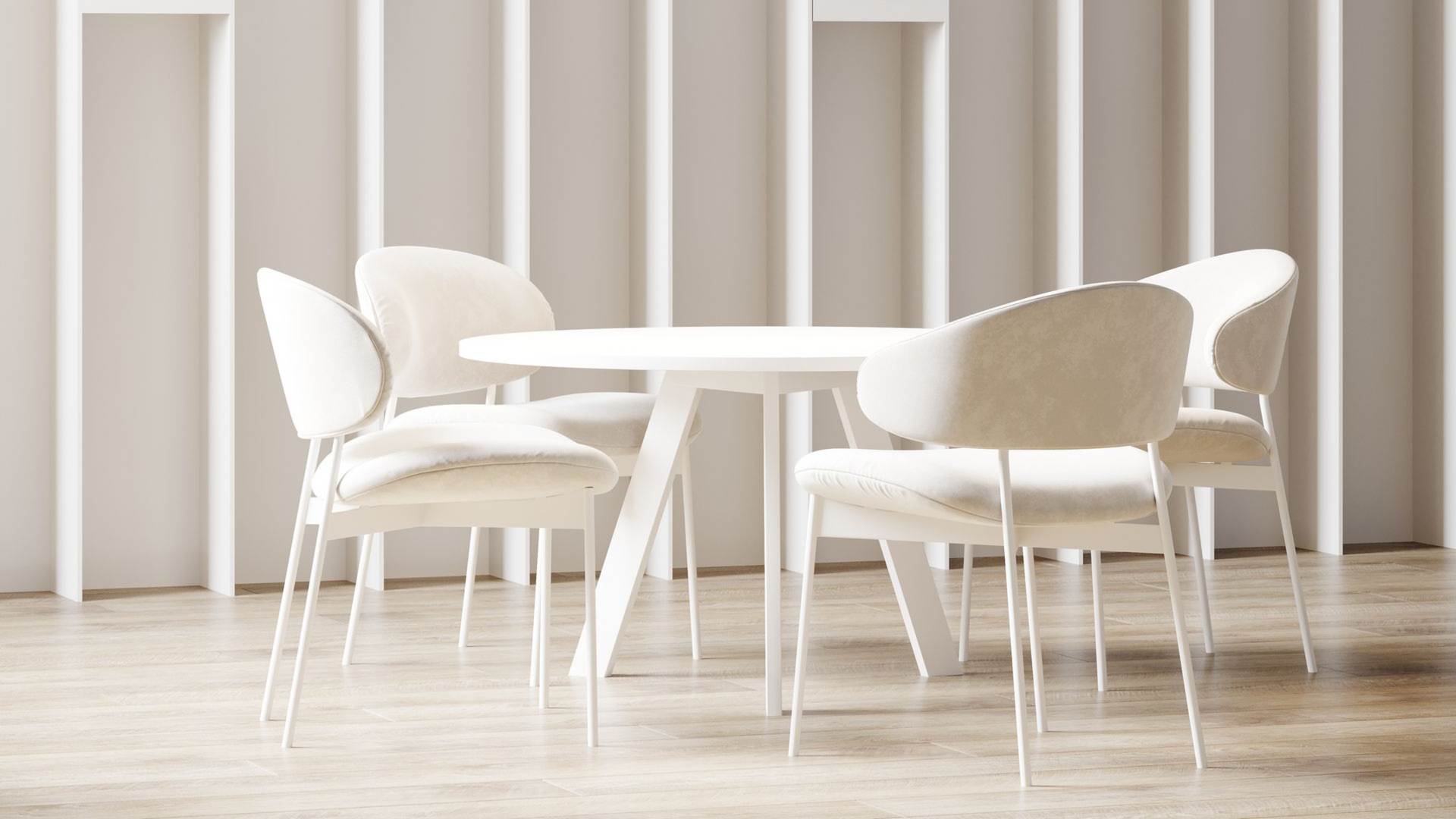
Cloud Dancer functions less as a neutral 'non‑colour' and more as a design strategy: a soft, billowy backdrop that reduces visual noise, amplifies other materials and colours, and supports environments intended for focus, wellbeing and hospitality. The Pantone Colour Institute positions Cloud Dancer as a calming influence, providing a blank canvas for other design elements to shine.
What this means for architects and designers.
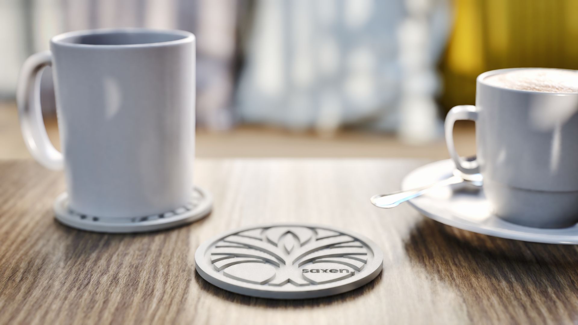
As a commercial interiors partner, Saxen can translate Cloud Dancer into practical, high‑performing spaces that meet operational needs while reflecting this cultural shift toward simplicity and mindful design.
Brand‑forward backdrops.
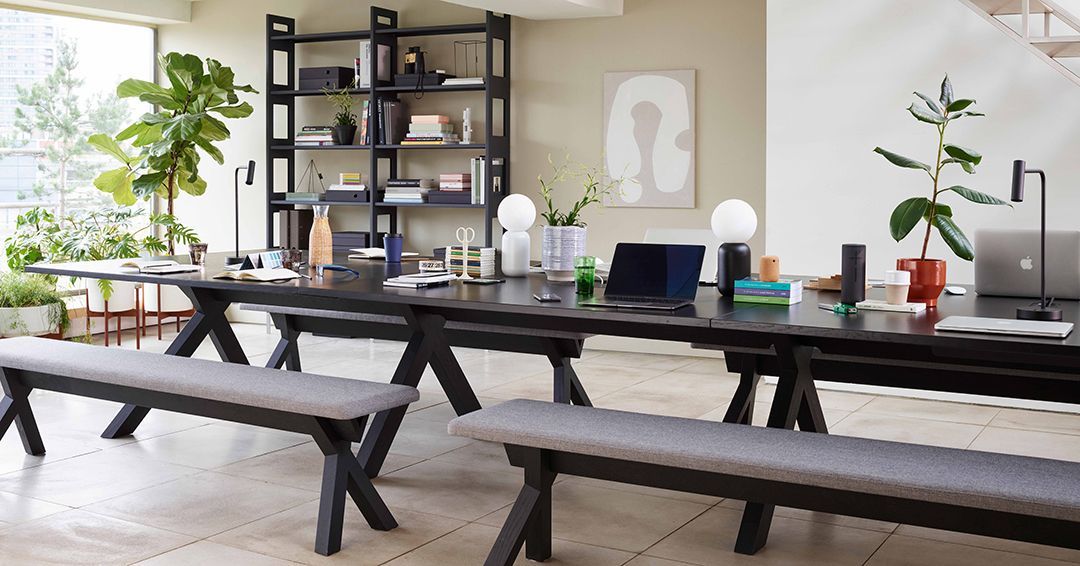
Use Cloud Dancer on reception walls, wayfinding panels and ceiling planes to create a refined, neutral canvas that makes brand colours and art installations pop.
Flexible workplace zones.
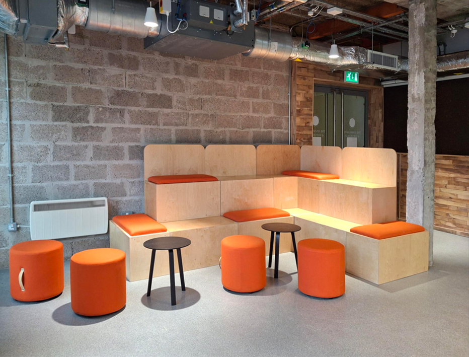
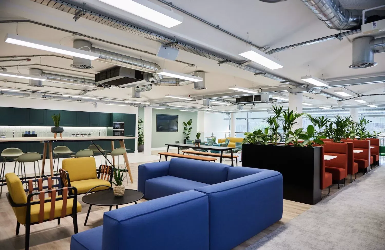
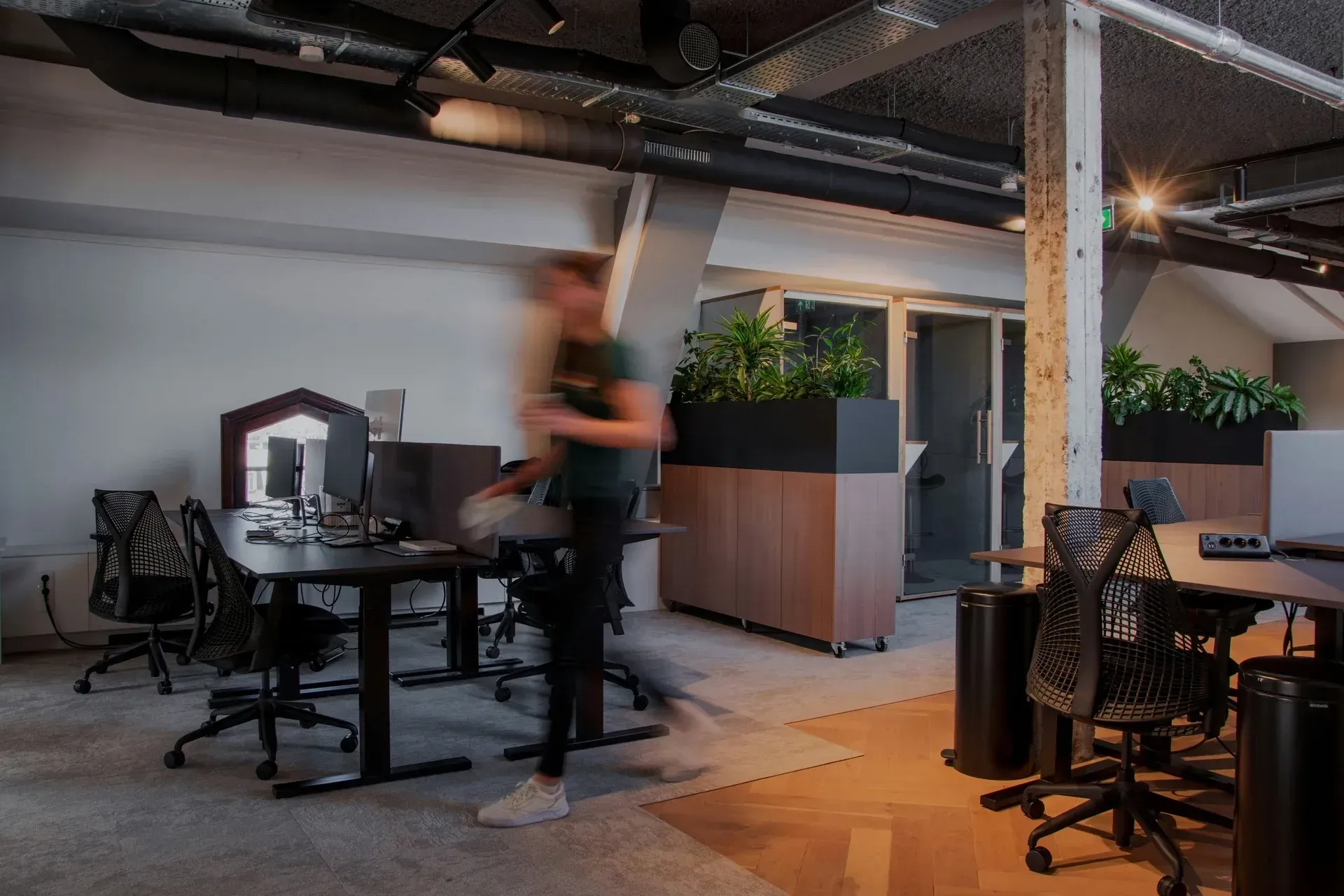
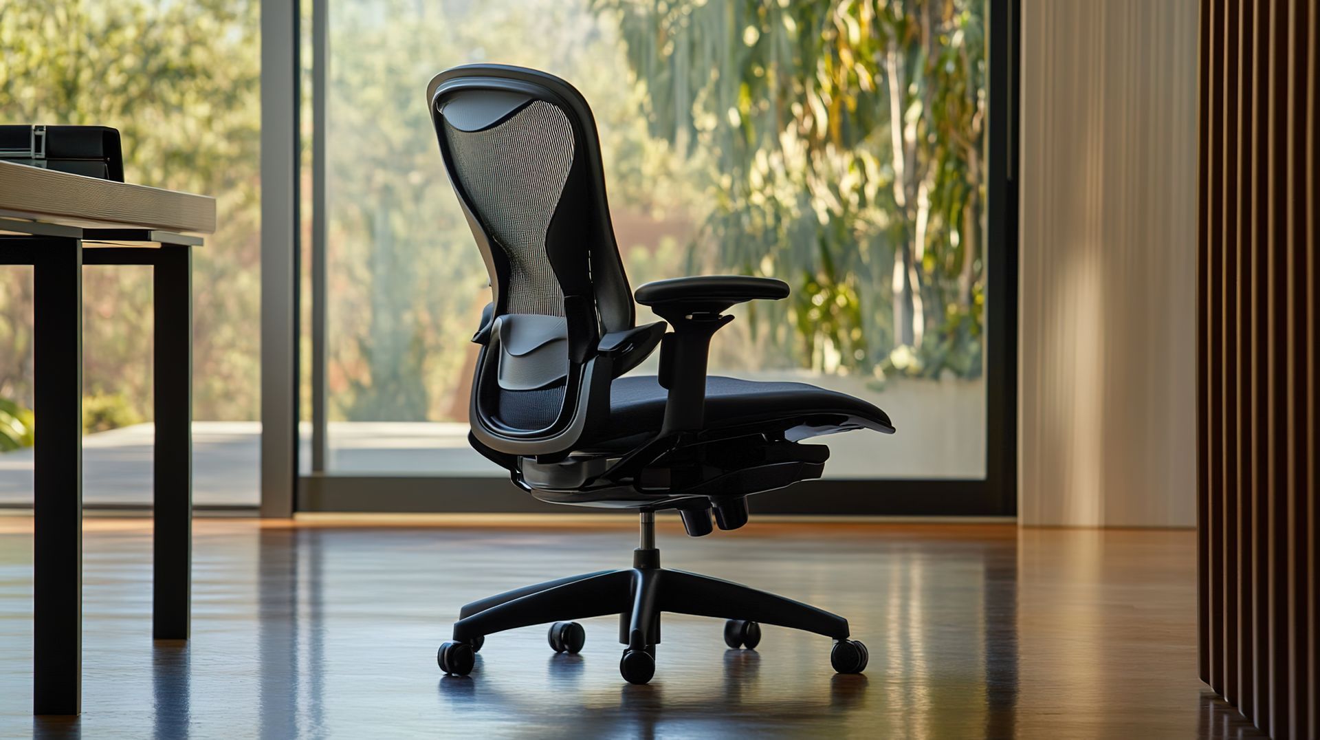
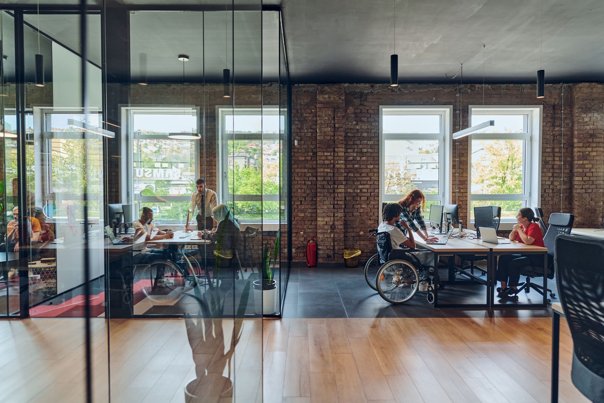
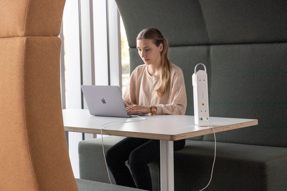
Implement Cloud Dancer in touchdown zones, meeting rooms, and quiet lounges to minimise distractions and visually unify different activity types.
Healthcare & hospitality.
Soft white surfaces promote perceptions of hygiene and calm; pair with tactile, warm surfaces to avoid a sterile feel. Saxen's RefurbHub is equipped to reupholster furnishings using antimicrobial fabrics, ensuring a higher standard of hygiene and peace of mind for our clients.
Retail & showrooms.
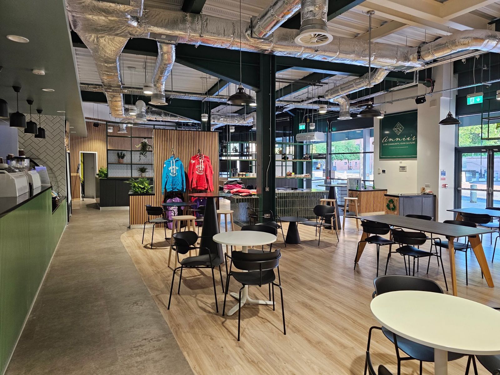
Cloud Dancer creates a highly versatile merchandising backdrop that highlights product colour and texture without competing for attention.
"An airy white hue, PANTONE Cloud Dancer opens up space for creativity, allowing our imagination to drift so that new insights and bold ideas can emerge and take shape."
Laurie Pressman
Vice President, Pantone Color Institute
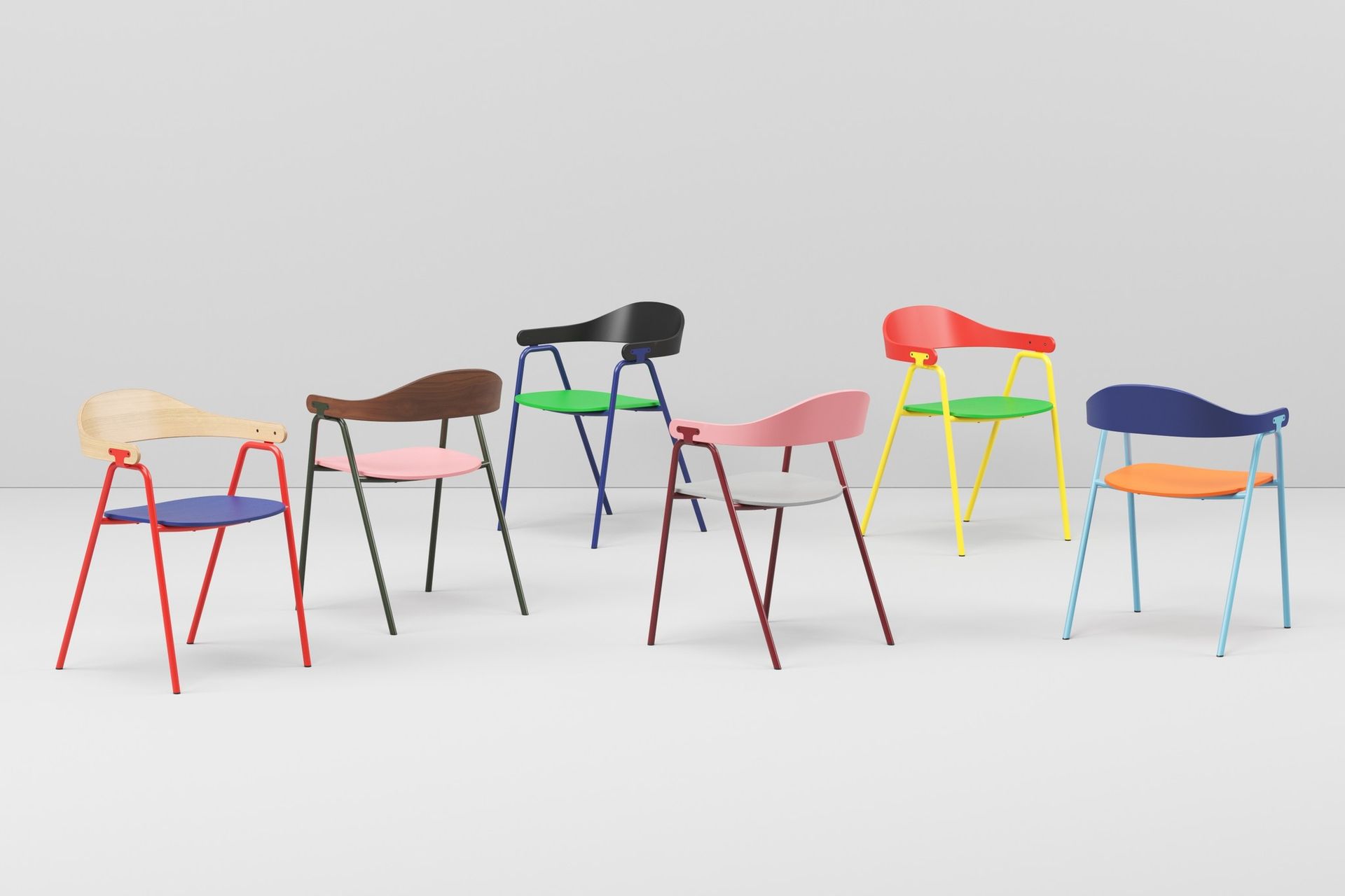
Design pairings and palettes.
Pantone describes Cloud Dancer as scaffolding for the colour spectrum — it’s intentionally compatible with both soft pastels and broader accents. Saxen recommends three palettes depending on brand intent:
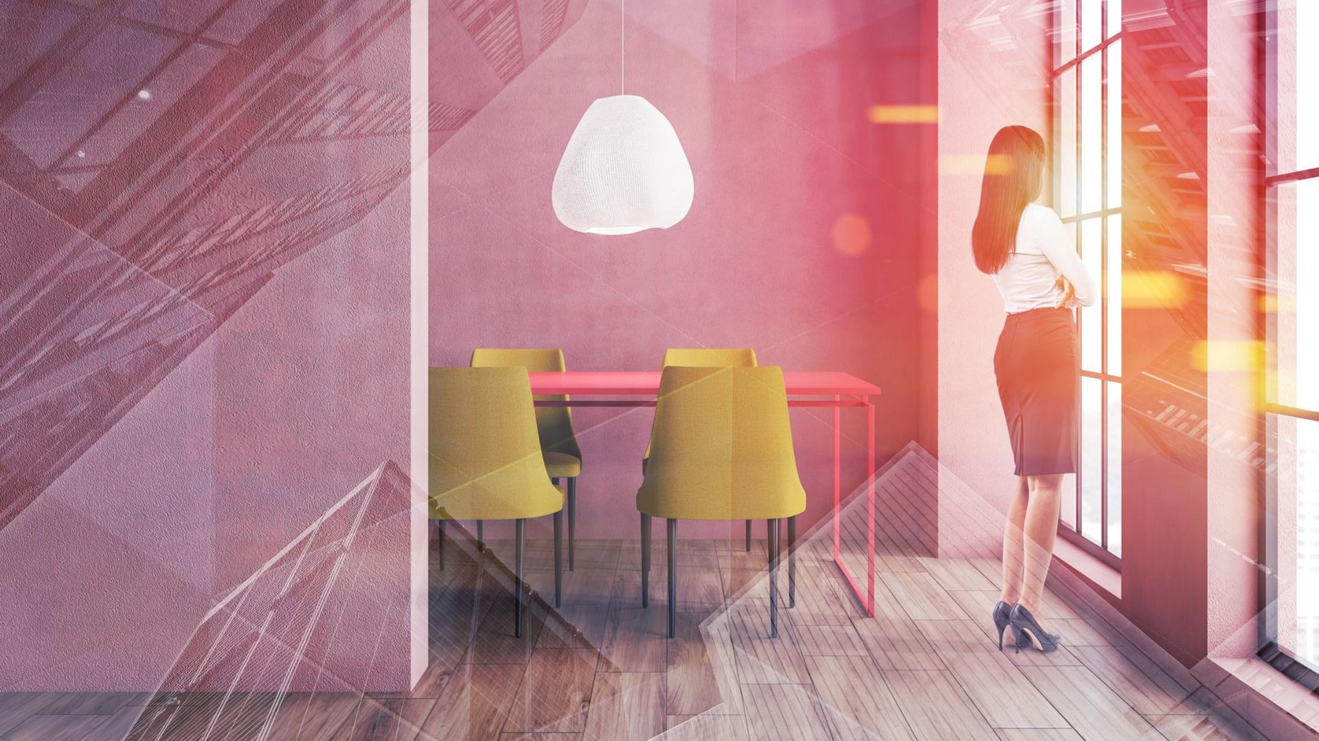
> Warm & human (hospitality, boutique offices)
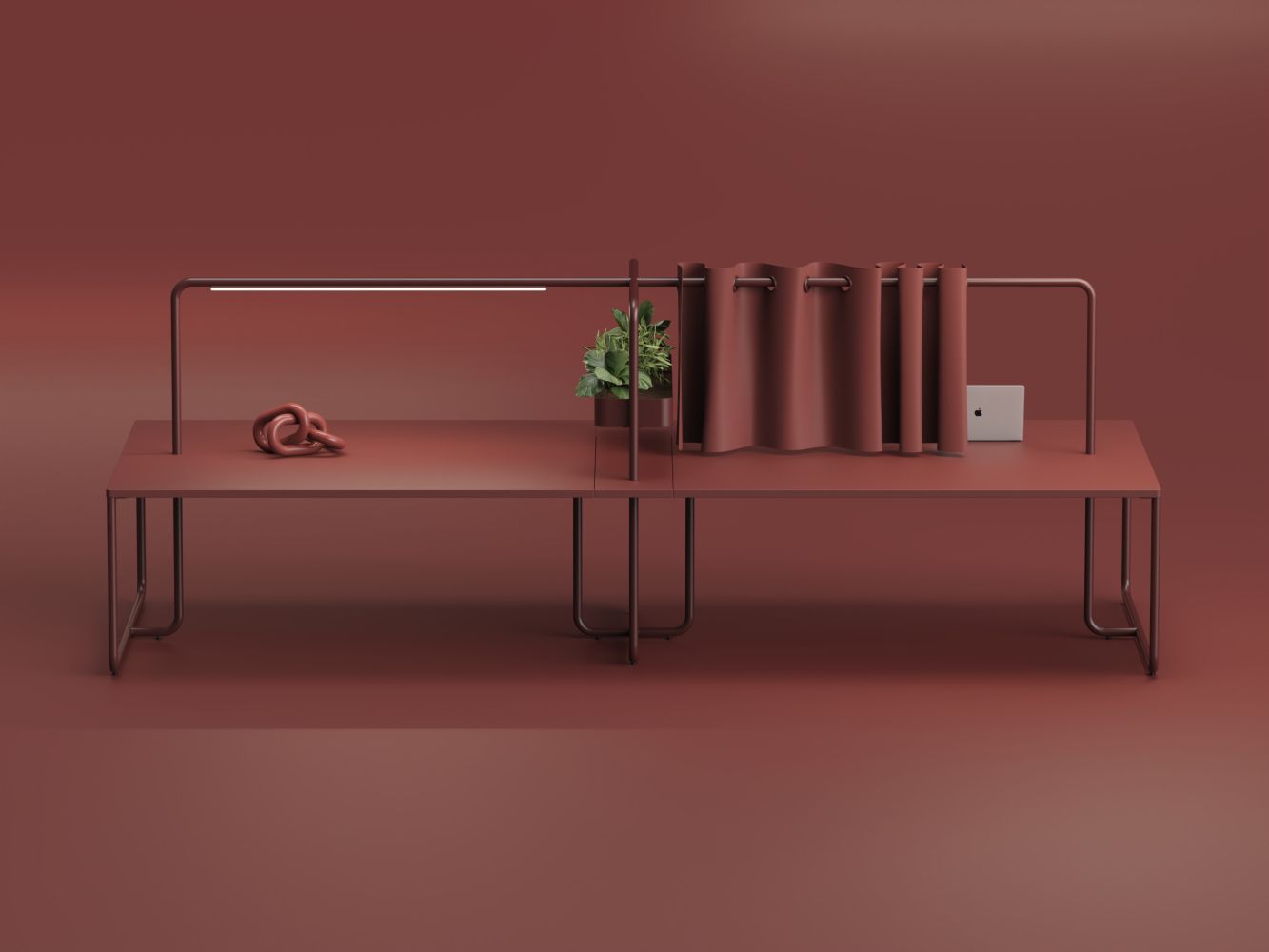
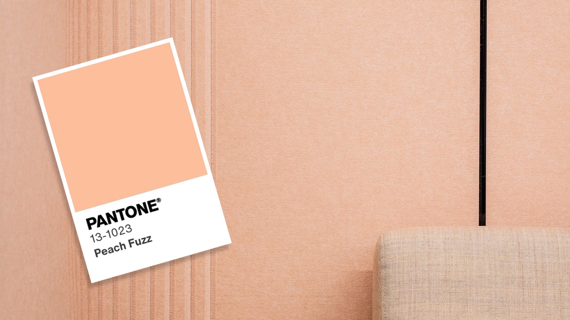
Cloud Dancer + warm wood tones, Mocha Mousse–style browns (Pantone’s 2025 pick), soft terracotta accents and muted brass.
> Calm & clinical (healthcare, wellness)
Cloud Dancer + pale sage, dove grey, layered natural textiles and matte white ceramics.
> Bold contrast (retail, creative studios)
Cloud Dancer + saturated navy or forest green accents, black metal trims and high‑contrast artwork.
Materials, finishes and durability.
> Paint and solid surfaces
Choose high‑performance matte or eggshell-finish commercial paints with cleanability ratings for high‑traffic areas.
> Textures
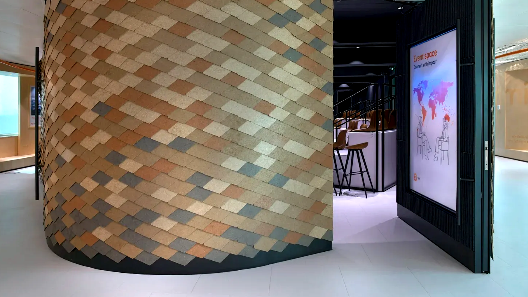
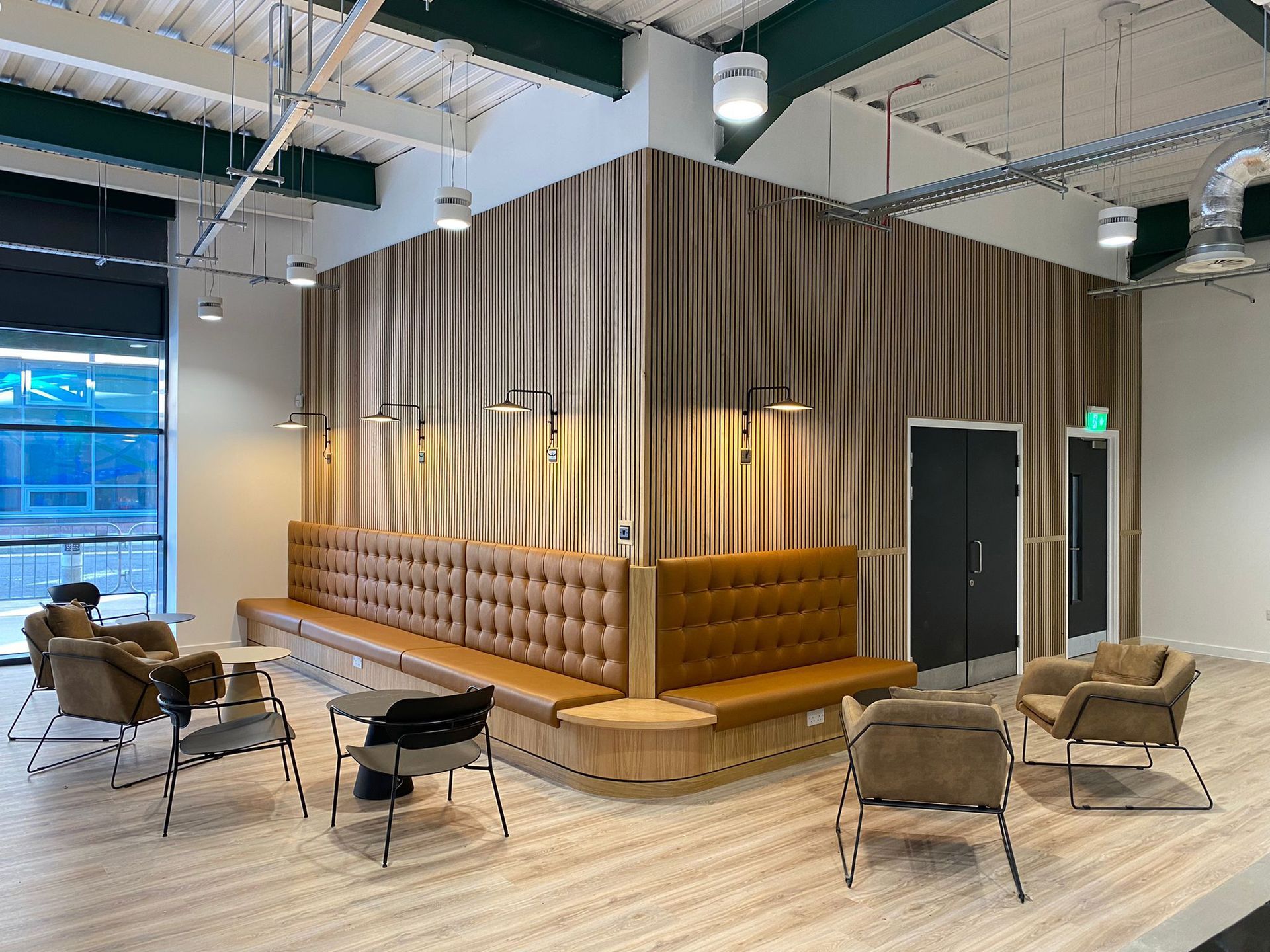
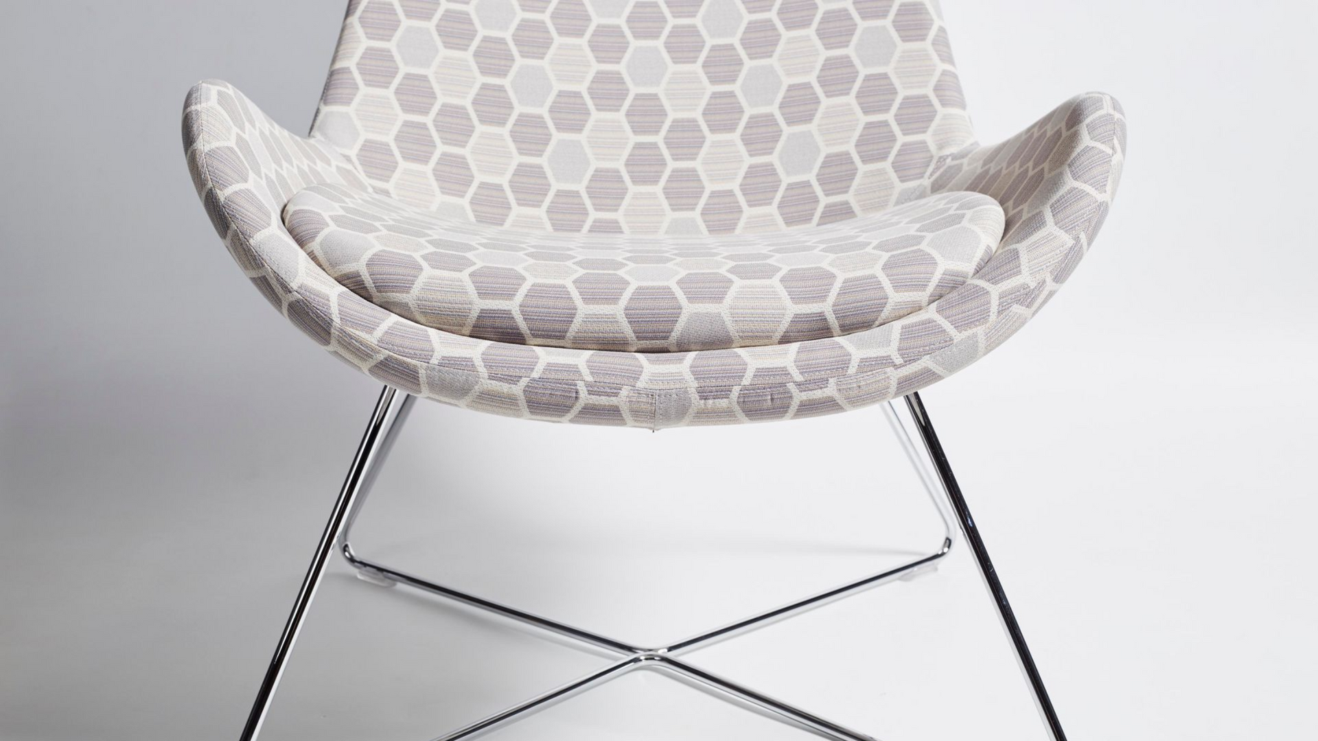
Introduce plaster, limewash, or micro‑textured wallpapers or tiles to break up large expanses of white and add depth.
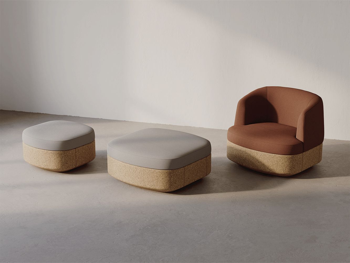
> Soft furnishings
Use patterned upholstery, acoustic panels and rugs to anchor white spaces and reduce reverberation.
> Metals & joinery
Brushed brass, warm
anodised aluminium and natural walnut provide warmth and visual grounding.
Lighting & perception.
White is highly dependent on light. To keep Cloud Dancer from reading flat or sterile:
> Use layered lighting
ambient (warm LED), task (adjustable), and accent (wash lighting for art/feature walls).
> Adjust colour temperature
2700–3500K keeps the white feeling warm and inviting in hospitality and office environments.
> Test in situ
Provide Saxen mockups under the actual project lighting before final specification.
Operational considerations.
> Maintenance
White surfaces show wear faster. For high‑touch areas, specify scrubbable finishes, antifade fabrics and replaceable modular elements.
> Accessibility
Ensure contrast for signage, wayfinding and controls; Cloud Dancer is a backdrop, not a substitute for required contrast levels.
> Sustainability
Reuse existing white or off‑white building elements where possible; choosing Cloud Dancer as a unifying palette can reduce the need for frequent refits.
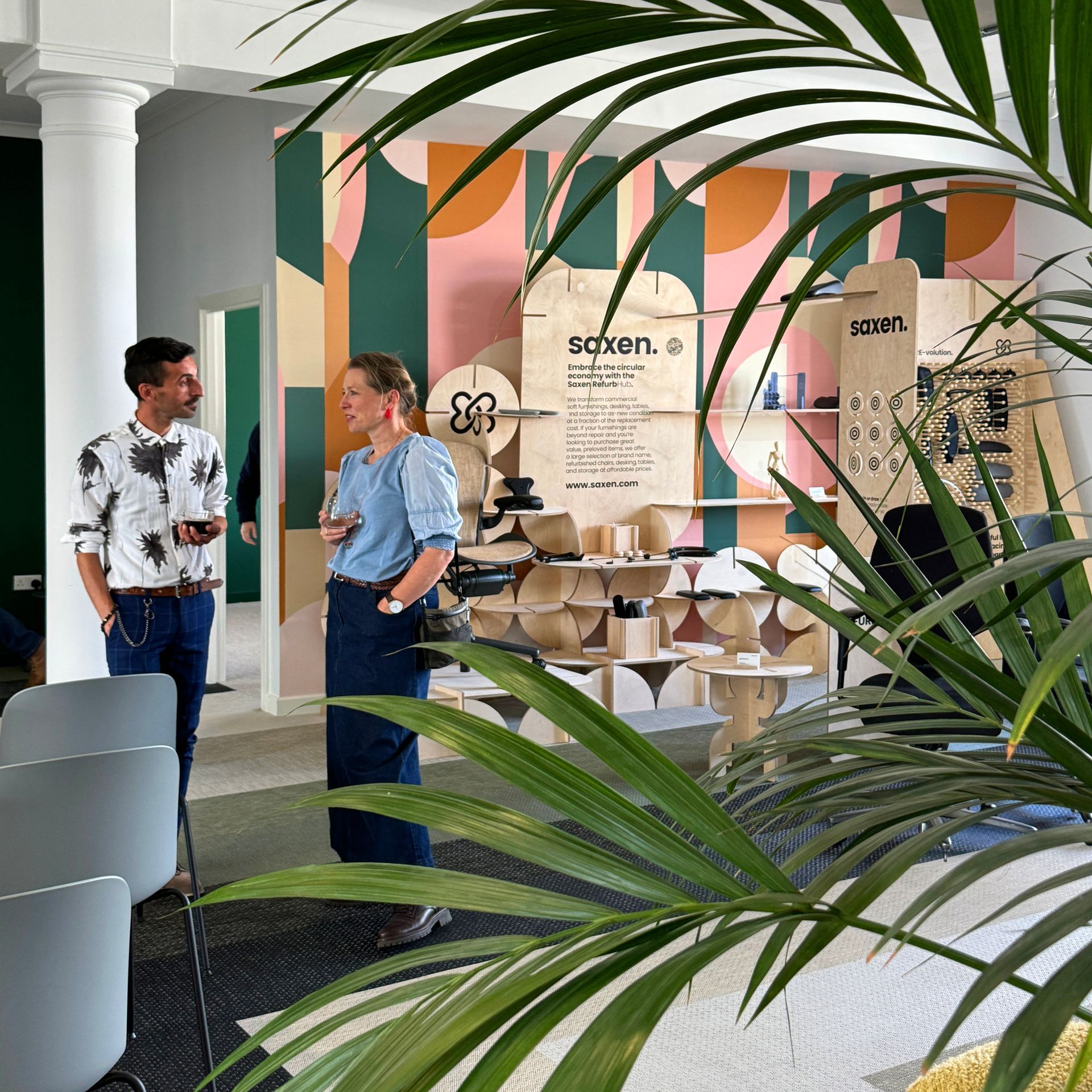
Join the RE:volution.
Use Cloud Dancer to elevate your interiors.
Pantone’s Colour of the Year often influences product launches, merchandising, and marketing across industries — choosing Cloud Dancer now creates an opportunity for brands to align interiors, collateral, and product displays with a dominant cultural tone of simplicity and renewal. Saxen can help clients coordinate those touchpoints, from sample boards to phased rollouts.
Cloud Dancer gives commercial interiors a timely tool: a composed, adaptable neutral that supports wellbeing and highlights what matters. If you’d like Saxen to develop a Cloud Dancer concept board, mock up a scheme, or run a pilot in one of your spaces, tell us the project type and square footage, and we’ll prepare custom options and cost estimates.
Please get in touch
to explore Saxen’s sustainable furniture solutions .
share this page
all posts.